Meet Modern Psychedelic: Home & Gift's new look and feel
.png/fit-in/700x9999/filters:no_upscale())
When The Better Trends Company were asked to come up with the creative concept for the Home and Gift show, we knew that we had to create something truly distinctive yet tailored to the show's elegant and heritage branding.
Our 2023 Modern Psychedelic design trend was the perfect starting point for the creative direction for the show. 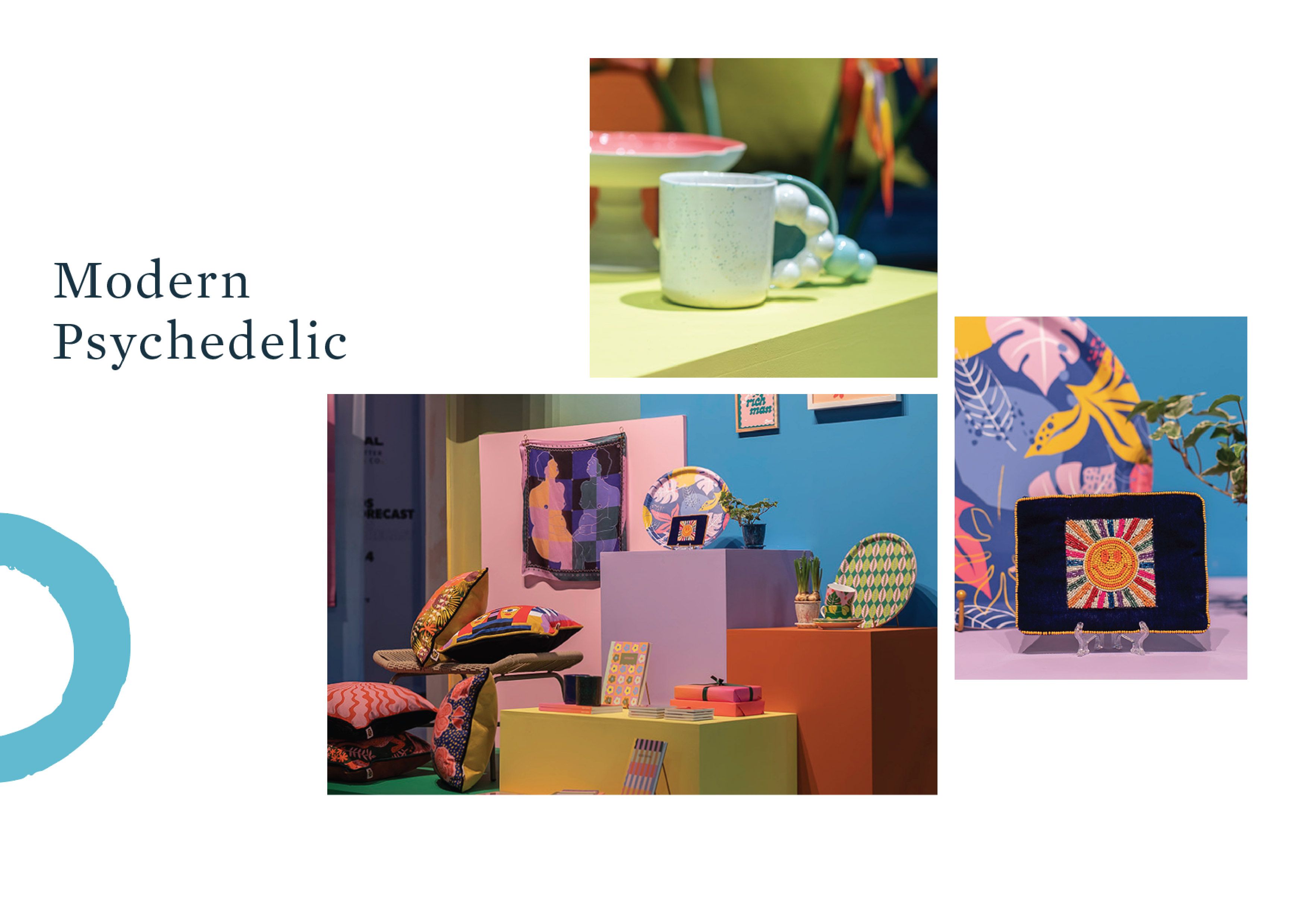
This trend is also part of a huge cultural shift: We are all becoming increasingly concerned about the state of our planet and current political situations, social justice… The list goes on. The modern psychedelic trend represents a resurgence of interest in psychedelic art, music, and culture that emerged in the 1970s and is often associated with a counter cultural ethos that embraces alternative lifestyles, environmentalism, and social justice causes - feeling very relevant today. Looking to vintage, joyful, analogue colours, prints and patterns, clothing and product is part escapism and part activist with a unique visual style that is both old school trippy and cutting-edge.
Striking graphics and bold colours are two defining characteristics of this trend yet, for Home and Gift, we knew it also had to be sophisticated and stylish. We knew that for this creative, less is more!
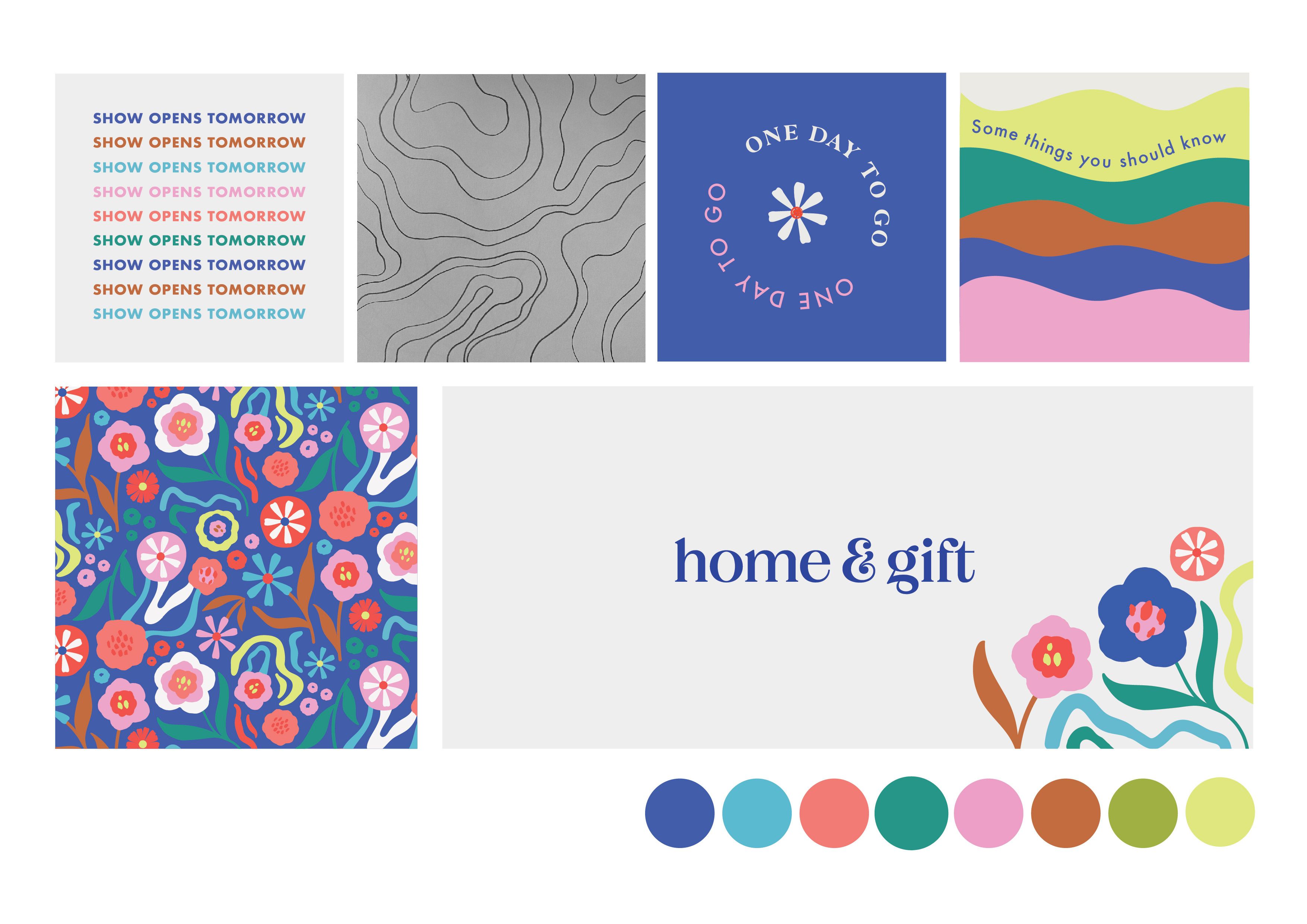
The team spent a long time pouring over bold and retro fonts, balancing colour palettes with the overall aesthetics and finally, we presented our visual options to the Clarion Retail team. Keeping the iconic H&G royal blue as the hero colour, we paired it with an illustrated floral pattern and all agreed it would be the perfect feature visual for the show. The graphic could be utilised in various ways, whether as a single daisy, a full repeat pattern, or a placement graphic on the corner of the design. To complement the flowers, we also incorporated a swirl pattern as a secondary graphic, adding a subtle nod to the trend while maintaining a cohesive and tonal look that aligned with the vibe of the Harrogate show.
We worked with our creative director Natalie’s hand-drawn illustrations then scanned and traced them digitally, giving a polished yet deliberately imperfect organic feel to the design.
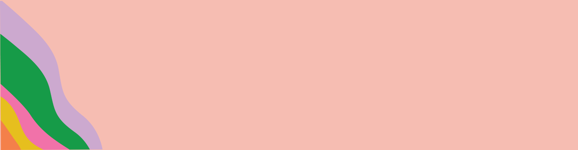
 Our approach to the colour palette for the show was to select six key trend colours for each of the various sectors, along with a complementary colour to be used alongside for clear and impactful wayfinding and design identity. The use of brights such as hot pinks, oranges, and zingy blues contrast with muted earthy tones like browns, dusty peach and forest greens for a contemporary feel.
Typography played a major role in the overall look and feel. We wanted to incorporate a retro aesthetic with a bold, 70's-inspired serif typeface, but we knew that overusing it could result in illegibility issues or just look cheesy. To overcome this challenge, we decided to use the serif typeface sparingly for headings and smaller amounts of text. For the main body copy, we chose a san-serif typeface. However, we didn't want to lose the playful element in our design. To bring back the sense of fun, we experimented with creating the text on wavy lines, using different colours and curved shapes.
The team managed to strike a balance between retro and modern design that feels exciting and fresh - we can’t wait to see how our design comes to life at the show!
Hope to see you all there and as usual - you can contact us with any comments or questions at Hello@thebettertrendscompany.com
Immerse yourself in the world of Modern Psychedelic at this year's Home & Gift - get your badge now!